
A correction to a 2011 paper doesn’t change its main conclusion: Hearing song lyrics about violence — “let the bodies hit the floor,” for example — can prompt aggressive behavior, even more so than violent imagery in music videos.
The correction follows an investigation by Macquarie University that found errors in data analysis to be an “honest mistake.”
During the study — “The effect of auditory versus visual violent media exposure on aggressive behaviour: The role of song lyrics, video clips and musical tone,” published in the Journal of Experimental Social Psychology — the authors measured the effect of violent songs or imagery using the “hot sauce paradigm.” In this model, researchers estimate people’s level of aggression by how much hot sauce they give another person to eat. The study found that, indeed, people who are exposed to violence — particularly, lyrics — give more hot sauce to their neighbors. It has been cited 6 times, according to Thomson Scientific’s Web of Knowledge.
One aspect of the paper prompted a tweet from a Dutch journalist:
Volstrekt wonderlijke grafieken kom je soms tegen, in de wetenschap. pic.twitter.com/ZbFG7OSjiI
— Maarten Keulemans (@mkeulemans) May 20, 2015
Statistician Richard Gill, who works at the University of Leiden in The Netherlands, told us that translates to “one comes across some amazing graphics, in science.” Gill quickly replied to the tweet. So did Chris Hartgerink, a PhD candidate at Tilburg University in The Netherlands, who is working on statistical methods to detect data fabrication:
@gill1109 @mkeulemans http://t.co/mZHeHWnPaq Those bars are very equal. — Chris Hartgerink (@chartgerink) May 22, 2015
The problem? The averages in the “no lyrics” group just looked too clean — how could groups of 15 people each dole out exactly the same amount of hot sauce?
There was indeed a problem with the graph, as the correction, published a couple of months later, explains:
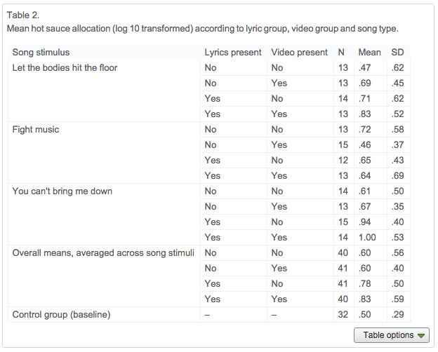
Reanalysis of the data for this paper reveals that an error was made in specifying the interaction model that produced the first three plots used in Fig. 1, producing estimated marginal means that were incorrect. The graph of overall means is correct. The table below provides the correct means.
Re-analysis with all interaction terms included has confirmed the initial finding that there was no main effect for song type, and further shows no two or three way interactions between song type and the other two variables. For this reason, the line on page 276 “There was no significant difference between the three songs in terms of hot chilli sauce allocated, F (2, 159) = 2.04, p = .133, and the pattern of hot chilli sauce allocation between groups was similar for all three stimuli (see Fig. 1)” should now read “There was no significant difference between the three songs in terms of hot chilli sauce allocated, F (2, 181) = 2.09, p = .126 and no two or three way interactions between song type and the other two variables (ps = .268–.777) (see Table 2 for means)”.
Bottom line: Listening to violent music can make you want to cook up a spicy chili. Here’s more of the backstory: Gill told us that he emailed the authors and the university, pointing out the curious graph, and requesting to see the original data set. Instead, he heard back from Karolyn (Kandy) White, the director of Research Ethics and Integrity at Macquarie, who told him that the matter was being handled by her office. White told us that the authors initiated the investigation, and had likely made an “honest mistake:”
I can confirm that the authors contacted Research Integrity at Macquarie University about an error in the Results Section of the above paper. An independent review of the data analysis was initiated by my office. The independent reviewer found “an error was made specifying the interaction model that produced the first three plots used in Figure one (1)” as noted in the corrigendum. Moreover, the reviewer found that this error was likely to be an honest mistake, and the overall findings of the study were reliable.
Laurie Rudman, the editor of the journal, told us:
I became JESP’s Editor in Jan 2013, so I don’t know whether the original graph was questioned during the review process. In this case, retraction wasn’t warranted because (1) the correction does not qualify their central conclusions, and (2) the authors underwent a full investigation at their University which included re-analysis of their raw data by an independent statistician. Kandy White, Director of Research Ethics and Integrity, shared that report, and she assured myself and interested parties that the authors had been cleared.
The authors —Heidi Brummert Lennings, now a post-doc at Harvard, and Wayne Warburton — provided the backstory from their perspective, which echoed what everyone else told us:
We first became aware there may be an issue with the figures in the above paper when we were contacted by other researchers in May this year. We felt that the most appropriate response was to replicate our analyses and also ask for an independent review of the analysis. This was coordinated by the Research Integrity Office at Macquarie University. Our re-analysis of the data confirmed the key findings but could not reproduce the means in the contentious figure. The independent review revealed that when the plot was specified in SPSS, the interaction terms had not also been specified, resulting in estimated marginal means that were simply incorrect. The other findings were confirmed. The reviewer concluded this was likely an honest mistake in the data analysis. We sent the Editor of JESP a letter informing them of the error, along with a suggested corrigendum. Macquarie University also contacted the editor and provided a copy of the independent review. The nature of the error, along with the new analyses, are clearly spelt out in the corrigendum you have seen.
For his part, Hartgerink (who, like Gill, noticed the graph on twitter and emailed the authors), is satisfied with the outcome:
Peculiarities in research do not imply research fraud, but that something might be problematic and warrants further inspection (or that something is not peculiar after careful reading). I am actually glad to see it was an honest error and not research fraud.
Like Retraction Watch? Consider making a tax-deductible contribution to support our growth. You can also follow us on Twitter, like us on Facebook, add us to your RSS reader, and sign up on our homepage for an email every time there’s a new post. Click here to review our Comments Policy.
It should be a no-no to publish a graph with an origin other than (0;0). Doing so exaggerates the findings.
Perhaps. But it would make graphs of the Earth’s surface temperature fairly unexciting. They would show a not quite one-degree rise to about 288 degrees Kelvin, or an increase in the graph line of one part in 300.
===|==============/ Keith DeHavelle
The variable on the y-axis is the logarithm, to base 10, of the dose of chili-sauce, measured in grams.
I have redrawn the graphics, adding error bars, at http://rpubs.com/gill1109/chili
I also wrote to the authors again requesting the data but get no answer at all.