
Ever wanted to hone your skills as a scientific sleuth? Now’s your chance.
Thanks to the American Society for Biochemistry and Molecular Biology (ASBMB), which is committed to educating authors on best practices in publishing, figure preparation, and reproducibility, we’re presenting the fifth in a series, Forensics Friday.
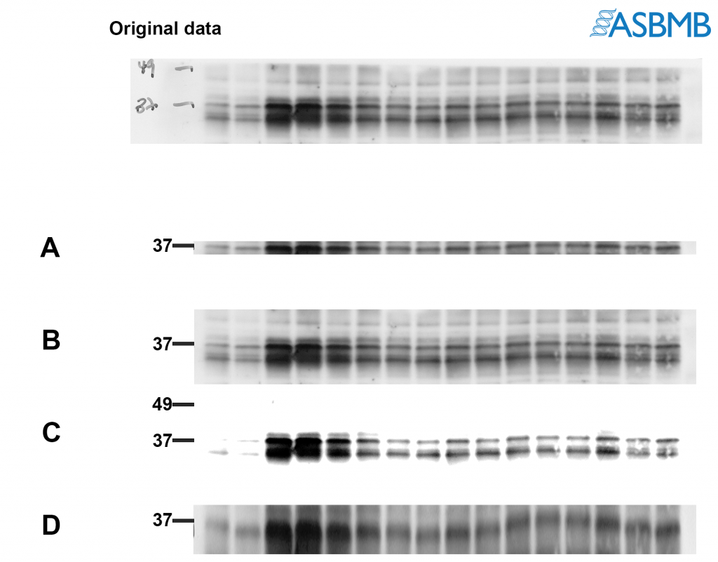
Take a look at the image below, and then take our poll. After that, click on the link below to find out the right answer.
Think you chose the right answer? Click here to find out.
And check out last week’s Forensics Friday.
Like Retraction Watch? You can make a tax-deductible contribution to support our work, follow us on Twitter, like us on Facebook, add us to your RSS reader, sign up for an email every time there’s a new post (look for the “follow” button at the lower right part of your screen), or subscribe to our daily digest. If you find a retraction that’s not in our database, you can let us know here. For comments or feedback, email us at [email protected].
I like the positive perspective! A good reminder that we need to focus on answering “how could this be best presented” questions as much or more than “what’s wrong with this figure” prompts when talking about these sorts of problems.
If I may suggest, perhaps if you do another one similar to this in the future, you’d write a short “explanation” with the correct answer? Or maybe link to the journal policy on gel/blot figures? Yeah, I and probably most of your regular readers can tell exactly why the “wrong” strips are wrong, but it might be helpful to still show people the explanation, because over-cropped/over-processed blot images aren’t exactly uncommon and obviously some still need the education. Just a thought.
Good Idea, Dr J, i.e., creating a more or less running source – a publicly available string – of authoritative opinion (perhaps by the ABSMB), to which others could refer for educational purposes . . . or even ‘spine’ when needed!
RW, why not package a growing string of your FF’s examples into one link for that purpose? The beauty in being not (identifiably) case related is that such a repository could serve as citable a source of neutral opinion.
Thanks for the suggestions; our “Forensics Friday” category already gathers all of these into one link: http://retractionwatch.com/category/forensics-friday/
As for more of an explanation, would be happy to ask ASBMB, who provides these. Thanks.
Hi Dr. JonDoe! Thanks for the feedback. Regarding policies for presenting blots/gels, here are some useful links: http://jbcresources.asbmb.org/collecting-and-presenting-data and http://www.jbc.org/site/misc/edpolicy.xhtml#image_manipulation. The reason A is not recommended is because it shows too little around the band of interest and doesn’t give reviewers/readers an accurate representation of antibody performance. Besides, you may be cropping out something really important like a cleavage product which could be of potential interest. C is not recommended because it does not accurately show the true background of the blot and is obscuring some of the bands that are in the original image. D basically shows the same thing as A, but has been stretched vertically to make it appear as if more of the blot is being shown. First, it’s not treating the pixels equally (the aspect ratio is not being maintained). And importantly, it’s misrepresenting the actual results because it appears that the antibody is specific.
I agree, an explanation would be helpful. I’m a physicist. I am torn between B and C: to my physics mind, B looks lovely but it’s like a graph with only one tick mark (37). Having another tick mark (the 49) would help me. But I’m sure this is naive!
Hi Wayne! Thanks for the feedback. C is actually not recommended because the image has been altered too much from the original. You can see many of the features that were in the original image are missing in C. The image that is presented in the figure should resemble the original capture. Regarding the 49 kDa marker, you are right… it would have been better to include the tick mark at 49. The reason why I excluded it was when this experiment was performed, the membrane was cut into strips so that each strip could be probed using different antibodies. The cut is usually done with scissors or a razor blade so they’re not always straight. When I digitally cropped the blot to make B, I cropped it down to the edge of the strip… which also cropped out parts that correspond to 49 kDa in some parts of the blot. I felt it was better to exclude the marker since I had technically cropped it out in parts of B. Hope that makes sense!
Should be “none of the above”. Both A and C are either cropped or adjusted to remove the bands and 49. B shows the bands at 49, but they’re not labeled. D is just a mess.
I’m assuming that the purpose of the assay is to look for variations in 37 between groups. 49 must be a control band or it wouldn’t be labeled on the original data. All four of these layouts appear to be attempts to either obscure or play down the variation in the control band.
The right answer should just be the original data with more legible labels.