
Ever wanted to hone your skills as a scientific sleuth? Now’s your chance.
Thanks to the American Society for Biochemistry and Molecular Biology (ASBMB), which is committed to educating authors on best practices in publishing, figure preparation, and reproducibility, we’re presenting the fourth in a series, Forensics Friday.
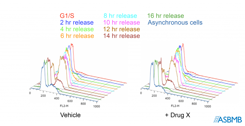
Take a look at the image below, and then take our poll. After that, click on the link below to find out the right answer.
Think you chose the right answer? Click here to find out.
And check out last week’s Forensics Friday.
Like Retraction Watch? You can make a tax-deductible contribution to support our work, follow us on Twitter, like us on Facebook, add us to your RSS reader, sign up for an email every time there’s a new post (look for the “follow” button at the lower right part of your screen), or subscribe to our daily digest. If you find a retraction that’s not in our database, you can let us know here. For comments or feedback, email us at [email protected].
There doesn’t appear to be a link to the poll here
The culprit seems to be a browser add-on that use called disconnect. Whitelisting the site makes the polls work
Could someone please explain how you would know the data was falsified in the red line?
Good Question K. In this case, if all you had only the second panel, there’d be no basis to question the image. However, the “noise’ denoted in the box looks the same as that in the traces the first panel. Yet the ‘weakest’ part of any (data) signal is also where should be more ‘random.’
It doesn’t mean the traces are necessarily a falsification of the experimental results, but it does raise the question of authenticity, and the need to see the original data.
The principles of looking at traces are the same as looking at grey scale images, in that falsifiers tend to overlook what is not important (to them) – whether it is the low amplitude signal (in this case) or background they can’t easily see in a blot, the points in the sparcer regions of two scattergrams, etc.
Thanks to RW and ASBMB for reminding us that images are more than just blots. How about some electrophysiology of single channel recordings, FACs scattergrams, and the flavor-of-the month, laser confocal Fluo-Antibody stuff?
The color-coding to distinguish lines might well be non-optimal for protanopic and deuteranopic readers, but that does not “add difficulty” for them. What turns the diagram into chartjunk is the fake perspective view, with lines obscuring one another.
Answer: You wouldn’t. Thats why that choice is NOT correct answer. You can figure answer out without knowing it.